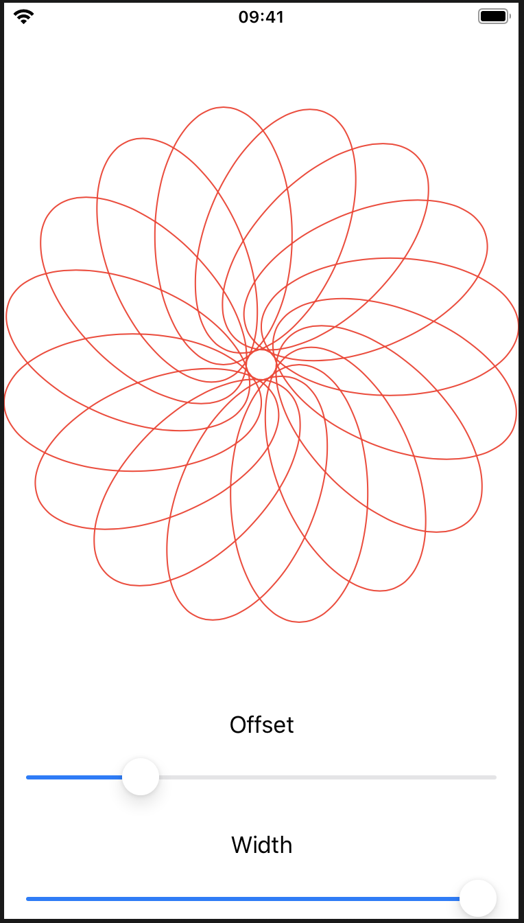
単純な形状やパスを超えて移動すると、SwiftUIの2つの便利な機能が組み合わさって、驚くほど少ない作業で美しいエフェクトを作成できます。1つ目はCGAffineTransformであり、パスまたはビューを回転、スケーリング、またはシアーする方法を記述します。もう1つは偶奇の塗りつぶしで、重なり合う形状のレンダリング方法を制御できます。
CGAffineTransformと偶奇の塗りつぶしを使用した形状の変換
Transforming shapes using CGAffineTransform and even-odd fills
import SwiftUI

//-------------------
struct Flower1: Shape {
    //How much to move this petal away from the center
    var petalOffset: Double = -20
    // How wide to make each petal
    var petalWidth: Double = 100

    func path(in rect: CGRect) -> Path {
        // オリジナルの楕円描画
        let originalPetal = Path(ellipseIn: CGRect(x: CGFloat(petalOffset), y: 0, width: CGFloat(petalWidth), height: rect.width / 2))
        // 位置
        let rotation = CGAffineTransform(rotationAngle: 4)
        // 位置を元に回転 画面の幅と高さの半分
        let position = rotation.concatenating(CGAffineTransform(translationX: rect.width / 2, y: rect.height / 2))
        return originalPetal.applying(position)
    }
}
//-------------------
struct Flower2: Shape {
    // How much to move this petal away from the center
    var petalOffset: Double = -20

    // How wide to make each petal
    var petalWidth: Double = 100

    func path(in rect: CGRect) -> Path {
        // The path that will hold all petals
        var path = Path()

        // Count from 0 up to pi * 2, moving up pi / 8 each time
        for number in stride(from: 0, to: CGFloat.pi * 2, by: CGFloat.pi / 8) {
            // rotate the petal by the current value of our loop
            let rotation = CGAffineTransform(rotationAngle: number)

            // move the petal to be at the center of our view
            let position = rotation.concatenating(CGAffineTransform(translationX: rect.width / 2, y: rect.height / 2))

            // create a path for this petal using our properties plus a fixed Y and height
            let originalPetal = Path(ellipseIn: CGRect(x: CGFloat(petalOffset), y: 0, width: CGFloat(petalWidth), height: rect.width / 2))

            // apply our rotation/position transformation to the petal
            let rotatedPetal = originalPetal.applying(position)

            // add it to our main path
            path.addPath(rotatedPetal)
        }

        // now send the main path back
        return path
    }
}

struct ContentView: View {
    //@State private var petalOffset = -20.0
    @State private var petalOffset = -20.0
    @State private var petalWidth = 100.0

    var body: some View {
        VStack {
            //Flower1(petalOffset: petalOffset, petalWidth: petalWidth)
            //    .stroke(Color.red, lineWidth: 1)
            //Flower2(petalOffset: petalOffset, petalWidth: petalWidth)
            //  .stroke(Color.red, lineWidth: 1)

            // Flower2(petalOffset: petalOffset, petalWidth: petalWidth)
            //.fill(Color.red)

            Flower2(petalOffset: petalOffset, petalWidth: petalWidth)
            .fill(Color.red, style: FillStyle(eoFill: true))

            Text("Offset")
            Slider(value: $petalOffset, in: -40...40)
                .padding([.horizontal, .bottom])

            Text("Width")
            Slider(value: $petalWidth, in: 0...100)
                .padding(.horizontal)
        }
    }
}
ImagePaintを使用したクリエイティブな境界線と塗りつぶし
Creative borders and fills using ImagePaint
ImagePaint
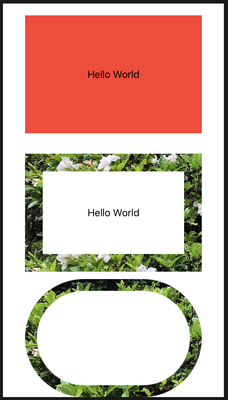
struct ContentView: View {

    var body: some View {
        VStack{
            Text("Hello World")
            .frame(width: 300, height: 200)
            .background(Color.red)
            Spacer()
        /*
        Text("Hello World")
        .frame(width: 300, height: 200)
        .background(Color.red)

         Spacer()

        Text("Hello World")
        .frame(width: 300, height: 200)
        .border(Color.red, width: 30)

        Spacer()
    */
        Text("Hello World")
        .frame(width: 300, height: 200)
        //.background(Image("IMG_1301") .resizable())
        //.border(ImagePaint(image: Image("IMG_1301"), scale: 0.1), width: 30)
        .border(ImagePaint(image: Image("IMG_1301"), sourceRect: CGRect(x: 0, y: 0.25, width: 1, height: 0.5), scale: 0.1), width: 30)

        Capsule()
        .strokeBorder(ImagePaint(image: Image("IMG_1301"), scale: 0.1), lineWidth: 20)
        .frame(width: 300, height: 200)


        }
    }
}
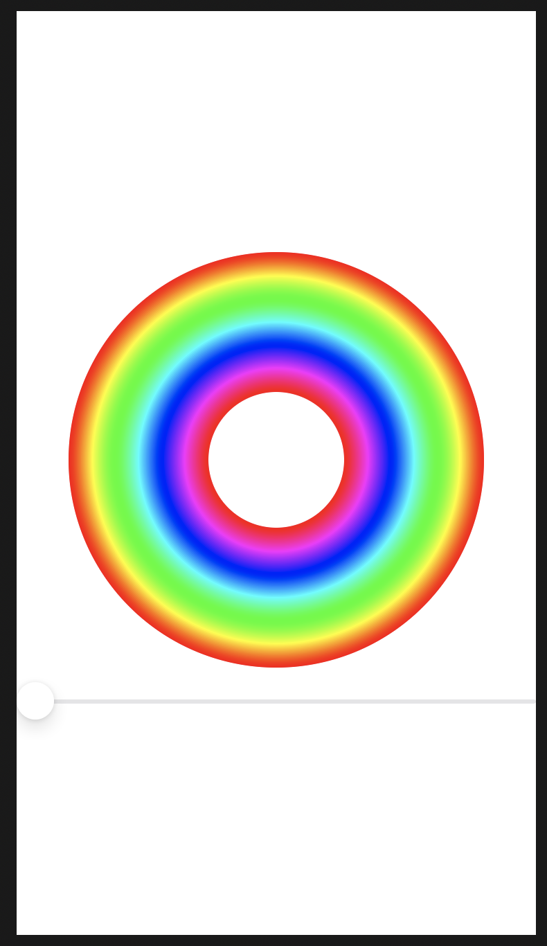
drawingGroup()を使用して高性能なメタルレンダリングを有効にする
Enabling high-performance Metal rendering with drawingGroup()
SwiftUIは、デフォルトでレンダリングにCore Animationを使用する
import SwiftUI
//-----------------------------
struct ColorCyclingCircle: View {
    var amount = 0.0
    var steps = 100

    var body: some View {
        ZStack {
            ForEach(0..<steps) { value in
                Circle()
                    .inset(by: CGFloat(value))
                    .strokeBorder(self.color(for: value, brightness: 1), lineWidth: 2)
                    //.strokeBorder(Color.red)
            }
        }
    }
    //--------------
    func color(for value: Int, brightness: Double) -> Color {
        var targetHue = Double(value) / Double(self.steps) + self.amount

        if targetHue > 1 {
            targetHue -= 1
        }

        return Color(hue: targetHue, saturation: 1, brightness: brightness)
    }
}
//-----------------------------
struct ContentView: View {
    @State private var colorCycle = 0.0

    var body: some View {
        VStack {
            ColorCyclingCircle(amount: self.colorCycle)
                .frame(width: 300, height: 300)

            Slider(value: $colorCycle)
        }
    }
}
//-----------------------------
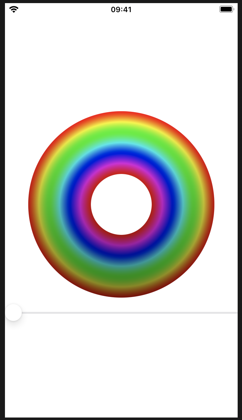
drawingGroup
これは、SwiftUIに、ビューのコンテンツを単一のレンダリングされた出力として画面に戻す前にオフスクリーンイメージにレンダリングする必要があることを通知します。これは大幅に高速です。舞台裏では、これは、非常に高速なグラフィックスのためにGPUを直接操作するためのAppleのフレームワークであるMetalを利用しています。
重要:drawingGroup()修飾子が知っていることが、あなたがそれらを打ったときにパフォーマンスの問題を解決する方法として、あなたの武器を保つために役立ちますが、あなたがすべきではないことが多いということ、それを使用しています。オフスクリーンレンダーパスを追加すると、単純な描画ではSwiftUIの速度が低下する可能性があるため、実際のパフォーマンスの問題が発生するまで待ってから、を呼び出そうとする必要がありますdrawingGroup()。
import SwiftUI
//-----------------------------
struct ColorCyclingCircle: View {
    var amount = 0.0
    var steps = 100

    var body: some View {
        ZStack {
            ForEach(0..<steps) { value in
                Circle()
                    .inset(by: CGFloat(value))
                    //.strokeBorder(self.color(for: value, brightness: 1), lineWidth: 2)
                    //.strokeBorder(Color.red)
                    .strokeBorder(LinearGradient(gradient: Gradient(colors: [
                        self.color(for: value, brightness: 1),
                        self.color(for: value, brightness: 0.5)
                    ]), startPoint: .top, endPoint: .bottom), lineWidth: 2)
            }
        }
        .drawingGroup()
    }
    //--------------
    func color(for value: Int, brightness: Double) -> Color {
        var targetHue = Double(value) / Double(self.steps) + self.amount

        if targetHue > 1 {
            targetHue -= 1
        }

        return Color(hue: targetHue, saturation: 1, brightness: brightness)
    }
}
//-----------------------------
struct ContentView: View {
    @State private var colorCycle = 0.0

    var body: some View {
        VStack {
            ColorCyclingCircle(amount: self.colorCycle)
                .frame(width: 300, height: 300)

            Slider(value: $colorCycle)
        }
    }
}
//-----------------------------